01 / 04Client work2025
Rajdhany Realtors
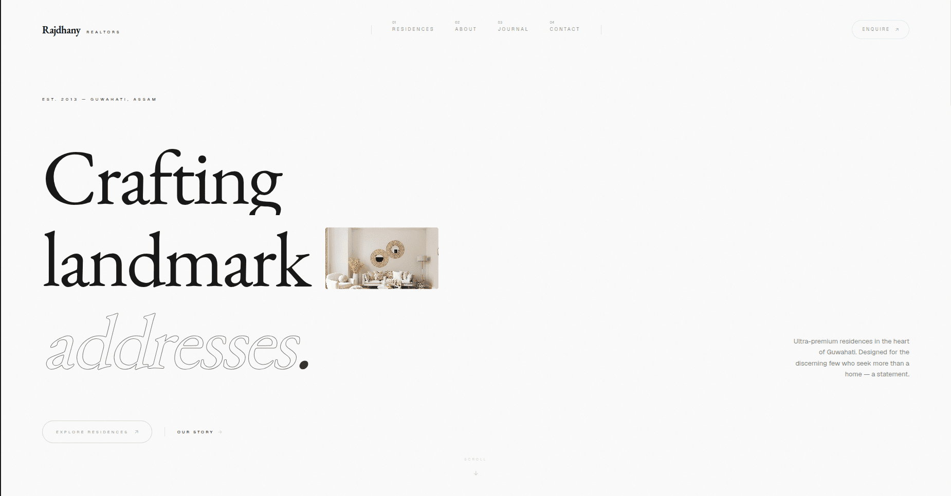
A premium property website that makes the offer, location and enquiry path clear from the first screen.
The situation
Rajdhany needed a digital presence that felt as considered as its residences without falling into the familiar property-listing template.
What changed
The structure did the heavy lifting.
- 01
Built an editorial hierarchy around the brand promise before introducing individual residences.
- 02
Used restrained typography, generous space and warm imagery to give the property work room to lead.
- 03
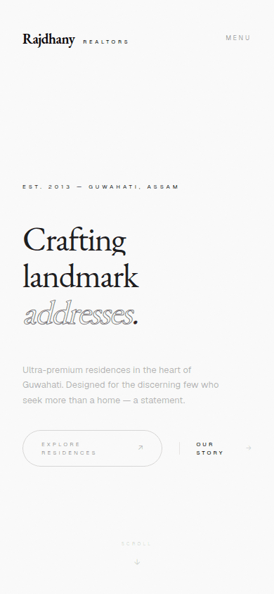
Kept exploration and enquiry visible as two clear paths across desktop and mobile.
The result
The site now establishes the positioning, location and next steps on the first screen. On mobile, the same story stays readable without shrinking the desktop composition into a cramped column.
Contribution
Brand direction, UX/UI design and frontend development
Next case study
Xvault Studio↗